8 Announcements – Los Angeles, Berlin
Gallery announcements are a problem. They are often produced cheaply, in large quantities, and made to disseminate with aggression: fliers posted on fences, cards littered on street corners, fistfuls pushed into legions of numbed post-show crowds. There is a garishness and unapologetic solicitation that accompanies fliers which are made by organizations that have the money to print them but not the reputation to forgo them. They are vestiges of an era of advertising that can only exist before the advent of the popularization of the internet where an ad can circulate with a politeness and exponential ubiquity online that print could never allow; when blue-chip galleries like Leo Castelli, Metro Pictures, and Ferus could print an announcement and trust it to reach the right demographic without forfeiting a certain decorum. This shift in etiquette, and the consequent bastardization of capitalism’s byproducts (announcements included) says something about how marketing has evolved with technology, how institutions and artists represent themselves, how a public receives them, and more pointedly, how graphic design as a practice is a fulcrum on which all of these issues tenuously balance.
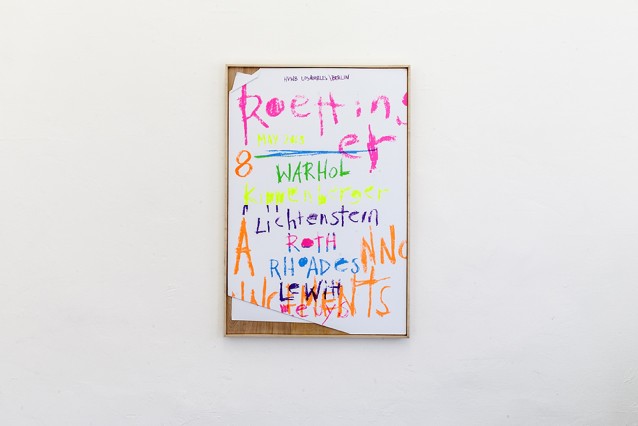
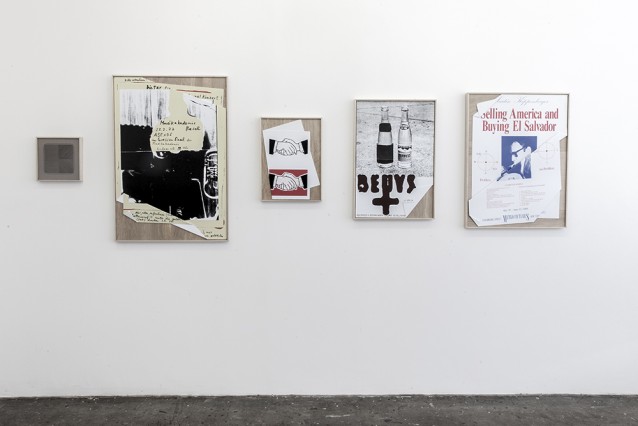
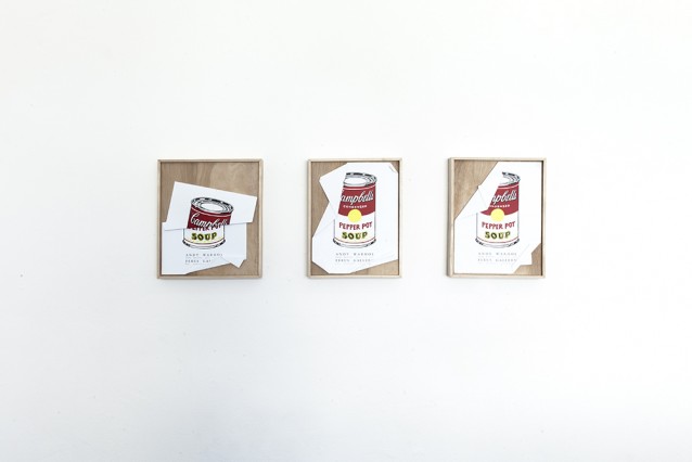
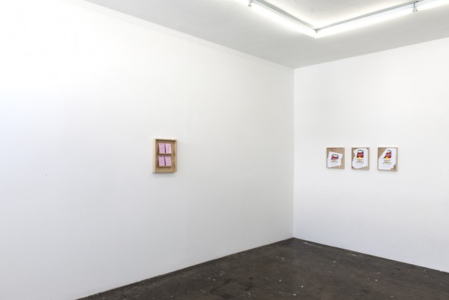
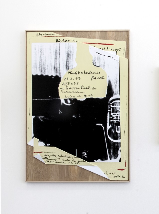
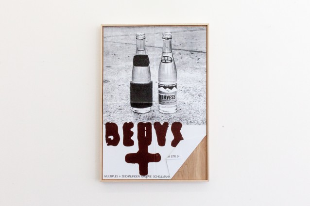
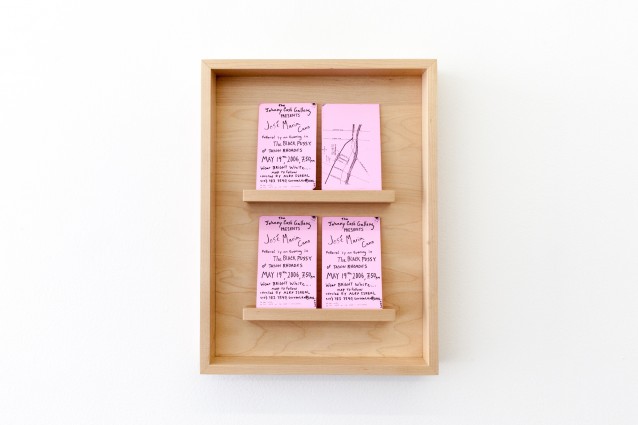
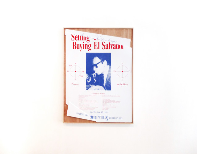
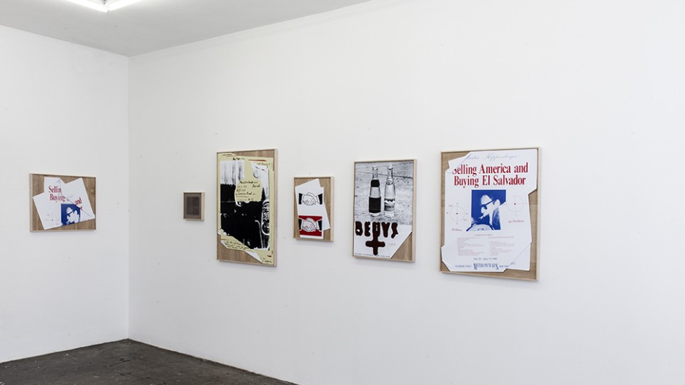
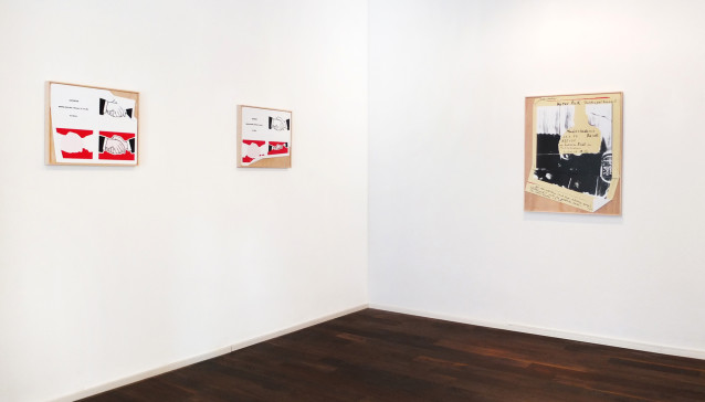
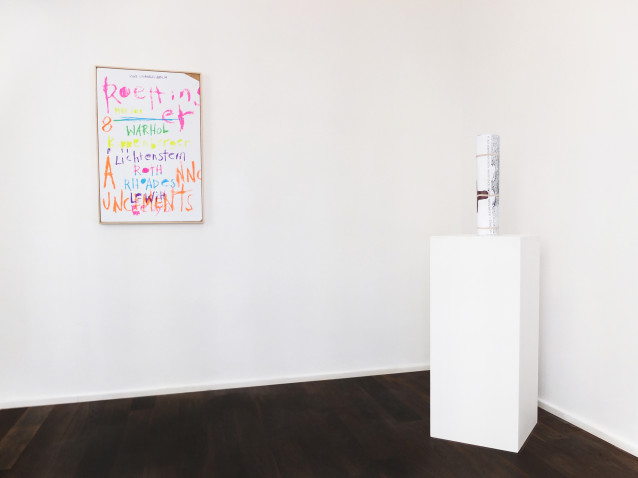
Andy Warhol’s Campbell’s Soup Cans live in the consciousness of art history as the most cited gesture of low-meets-high populism that has arguably become a summation for the entirety of Pop Art, and more dangerously, modernity. Here Roettinger has resurrected this screenprinted white-red two toned cylinder as one of 7 reproductions in 8 Announcements. Except these meticulously reproduced announcements are not copied onto paper, but yet another commercial advertorial medium: styrene. A rebellion of medium that Warhol and a cadre of artists were privy to when he pedestaled the soup can as a subject of fine art, and a rebellion that Roettinger later builds upon when he copies the exhibition announcement onto styrene, heats it into a plastic pliancy, and manipulates the image. Each crease is calculated and cleanly executed with graphic precision that sometimes obstructs the location and time, truncates a header, slices through Lichtenstein’s shaking hands, and crushes that fabled soup can. Not only does this compromise the function of announcements as information, there are more insistent expressions of critique: a sterile abuse, a characteristically punk refutation of institutional notoriety, and at the same time, a tribute paid. Warhol’s 1962 Soup Cans show at the Ferus gallery is one of many exhibitions posited as marking a period in which the art market would move to Los Angeles and where later the legacy of Pop would take root in an economy that better suited it. Roettinger tampers with not only the preciousness of his own immaculate reproduction, but also with the preciousness of its history, iconicity, and exclusivity.
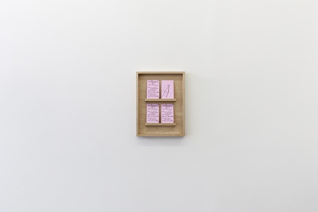
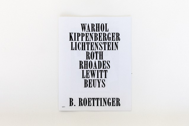
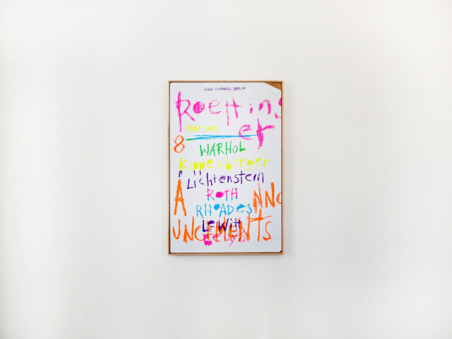
Roettinger has painstakingly reproduced 7 announcements from Warhol, Lichtenstein, Beuys, Kippenberger, Lewitt, Rhoades, Roth, and commissioned LA artist Aaron Curry to design one for his own exhibition. As a graphic designer for various cultural and educational institutions he is familiar with making an event announcement; however, he has garnered the most recognition for his album packaging. For Jay Z’s Magna Carta Holy Grail black lines associated with censorship and redacted information prompt the listener to scratch and rip the packing to reveal the lyrics, a move that is in solidarity with the political climate wrought by Snowden and Wikileaks where the iconological chimera that is “the” black bar was synonymous with governmental secrecy, mass surveillance, and the obfuscation of truth. His albums reject the disintegration of music into an online streaming monolith where the intimacy, tactile, and visual experience of an album is flattened to a 1” x 1” thumbnail on a digital screen. He rethinks its limitations and increases opportunities in which the content of the music can be communicated through accompanying materials such that the listener engages with the “album” as both object and idea. After all, music was his first introduction into design and issues much like the ones inherent in format (from vinyl, to CD, to MP3, to streaming) inform the works presented in 8 Announcements wherein the works oppose and react to an anxiety of the obsolescence of ephemeral, printed, or immaterial media. They are not solely reiterations of the problems posed by appropriation, reproducibility, authorship, or simulacra in that through the process of their making, they engage specifically with the discarded marginal histories of graphic design–their unique statuses and products–as aesthetic and material commodities to be valued, collected, preserved, and violated.
——————————————————
Brian Roettinger has been twice nominated for a Grammy in Recording Package and has recently worked with musicians No Age, Liars, St. Vincent, Beach House, Childish Gambino, Mark Ronson, and Florence and the Machine. Yves Saint Laurent commissioned Roettinger and Hedi Slimane as creative directors for their Autumn and Winter 2013 show. He has edited, curated, written, and designed books, catalogues, and other publications with Aaron Rose, Mandy Kahn, Aaron Curry, Alex Israel, William E Jones, John Wiese, Willo Perron among others. Educated at CalArts, he has since acted as design director of SCI-Arc until 2010, designed catalogues for the Hammer Museum, and completed a residency at UCLA’s Design | Media Arts program. He runs an independent record label and design studio as Hand Held Heart. He has exhibited at Colette in Paris, Stedelijk Museum in Amsterdam, Moravian Gallery, Brno, Czech Republic, and at Hope Gallery in Los Angeles. 8 Announcements is his first exhibition at HVW8.
opening Friday, May 8th, 7 – 10 pm.
email info@hvw8.com for inquires.
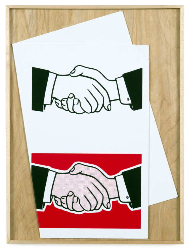
Brian Roettinger
Lichtenstein number 1, 2015
20 x 14.75 (framed)
Screen printed on styrene
Photo: Joshua White
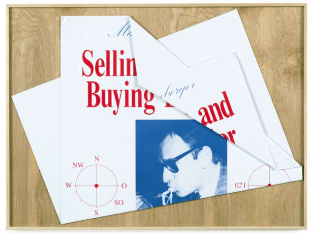
Selling America and buying El Salvador, 2015
29.75 x 22.5 (framed)
Screenprinted on styrene
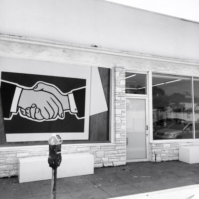

Los Angeles
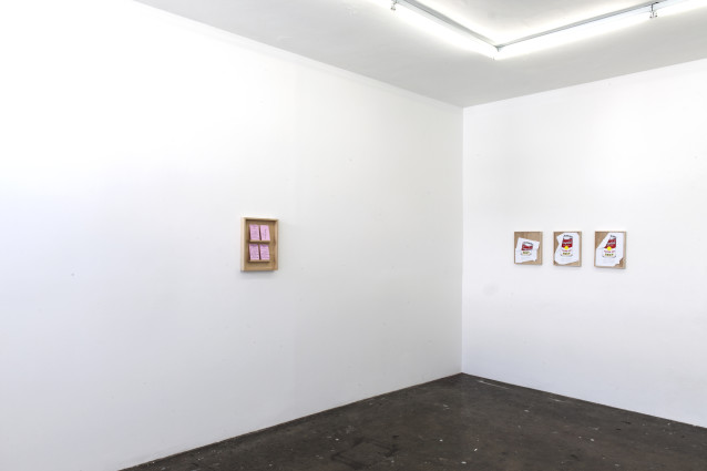
Berlin
